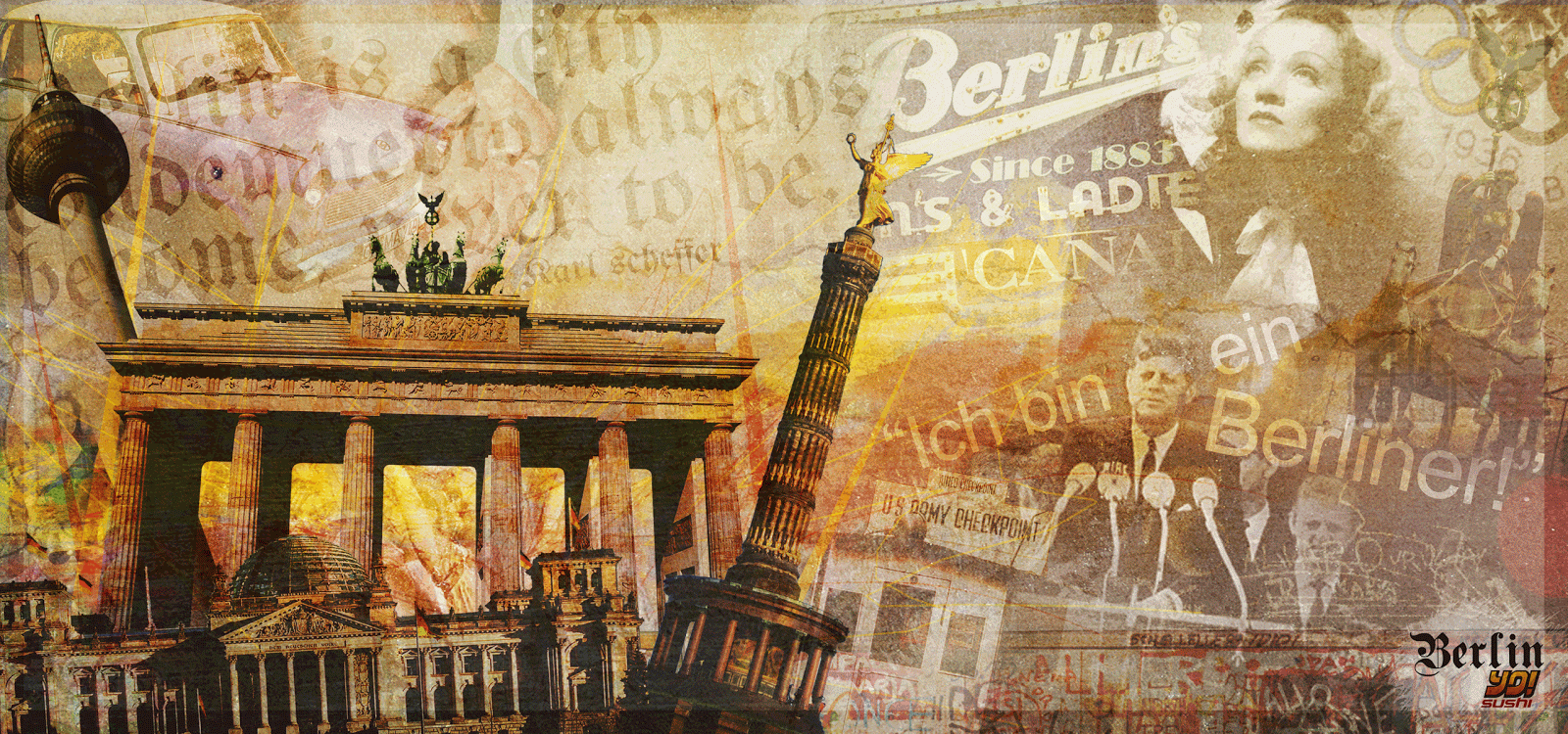
Although I will talk more about this in my development file, I will briefly explain some aspects of my design. I felt quite strongly about including some typography in my design, and used two very different typeface styles that I found in my research. One used for the infamous JFK quote "Ich bin ein Berliner!" and the other for a quote I came across that to me, really sums up Berlin's culture and the direction in which it is heading,"Berlin is a city condemned to become, not to be."
The logo has changed since early on in this project, but that is a result of my menu design that I have been working on along side this, but will discuss that when I come to showing those designs later on in my blog.
I have also added many more elements to the design and although it may look clustered at a small viewing size, blown up over a whole wall of a restaurant I think it will work brilliantly, noticing something new every time you look at it which is exactly what I was aiming for.
And finally the colour that I added to the design. Apart from faintly adding a yellow, red and black gradient over the whole designs, which helps tie in all the images, I focussed on applying the colour to the main focus images of my mural. Below shows briefly how I did this.

I wanted the colourful illustrations to be 'bursting' from these main landmarks and features of todays Berlin and pour over the rest of my design, contrasting with some of the historic black and white figures in the design. I feel this works well, and the grungy, messy style it has to it links in with the whole Berlin wall idea and feel that I was going for.
Once I have asked for final feedback and comments off my tutors, classmates and friends This design will be complete, and I can now move on to my menu design.
No comments:
Post a Comment