Monday 3 January 2011

Evaluation

On the whole I feel I have achieved what I set out to do in this Graphics & Branding Brief. Back at the start when we were to decide on what city to rebrand the yo!sushi restaurant in, I remember being positive that I was never going to feel inspired or motivated no matter where I chose and was looking for the easiest option. However, after deeper research into such places as New York, Amsterdam and Berlin my mind started to kick into gear and I felt like I was really starting to get my head round this whole Branding idea.

In the end I settled on Berlin, not only because I have been there on a number of occasions and have friends there, but because of its dark and troublesome past, its vibrant popular culture and its very much positive future. There was so much that I was learning about German and about Berlin in particular, so many iconic figures, historical events, amazing landmarks and vastly diverse culture, it simply had everything there as my building blocks to creating my designs and ultimately a brand identity.

With my design outcomes, I am beyond happy with how my restaurant mural turned out. I changed my mind so many times until something clicked and everything started to slot together. Focussed on the grunge style of Berlin with its graffiti and the Berlin wall, I aimed to forge a blend between the history and the present day, and am really happy with the design influences that I chose as they aided my progress greatly. If I was too do this all over again, I think I would have been more creative with some of the other design elements like direct mail and the menu, because there are so many unique ways to do those things that I didn't know about until my final research stages. However, I believe that I have met the demands of the brief accurately and to a high standard, and am very happy with the outcome.

Tuesday 28 December 2010

Direct Mail Done!

These are the designs for my yo!sushi Berlin direct mail, included here are the front and back designs and I hope to get a prototype made to show soon...


The concept of my direct mail is aesthetically in keeping with my brand style and ethos by creating an old/grunge style letter, but with an advertising twist whereas yo!sushi chopsticks are sent with the letter and if brought to the restaurant the customer receives a complimentary dish. My idea came from an old fashioned telegram which used to be a popular and effective way of getting news to someone quickly, with some added different effects this would be in keeping with my style and link in with the history of Berlin.


 I also chose to use mailing tubes instead of ordinary packaging, not only does it stand out from the common mail, but it will also allow me to roll my 'telegram' and safely package the chopsticks inside with as well. These could be made to look dated too or simply kept plain. 


 I am happy with the route I chose for my direct mail and with the overall outcome. I toyed with the idea of being more outlandish such as the concrete slab or candle letter I found in my research, but with costs and the environment in mind, I think mine is affective and serves it's purpose well.

UPDATE


Here are some pictures of the prototype I made.

Monday 20 December 2010

What is Direct Mail?

Although I had an idea of what direct mail was, i wanted to look into what the purpose of it was and also what design approach to take when designing my own.  When i put a search in for direct mail this is the definition that I came across...


"Direct mail is a way of advertising in which advertisers mail printed ads, letters or other solicitations to large groups of consumers. Bulk-mail rates are used to lower the cost of the mailing, and targeted mailing lists are used to maximize potential response. Direct mail is used in many different situations, limited primarily by the imagination of the advertiser. Stores typically use direct mail to advertise new products or to distribute coupons. Charities typically use the it to raise money or recruit volunteers. Almost any sales pitch can be made by direct mail."


So overall the main focus of direct mail is to directly advertise a company/product/event or to raise awareness an issue i.e charity. Knowing this makes a big difference to the way I approach my designs, as I need to think of a clever way to advertise yo!sushi Berlin and to attract potential customers at the same time. It will also need to be identifiable to my brand as it may be the only visual connection some people are going to get of my company/brand. Here are some examples of direct mail that I came across...


These examples that I have shown were just a few of many many more, and showed just how diverse direct mail can be, from the choice of material to how the customer interacts with. These have got my mind working overtime, but I need to keep in mind such factors as cost, resources and relevance when I design my own direct mail.

Tuesday 14 December 2010

Beer & Wine Done!

So I chose to run with the idea of simplicity on my labels. I decided that all the extra information and jargon used to sell a bottle of wine wasn't needed, the menu said what the house wine was and because it's only place of use would be in the restaurant, I chose to agin focus on the main identity of my brand for these designs. Here are my designs...


I opted for the same technique on both set of design, this was to use part of my mural design on each bottle, but to edit them in a way that reflects the drink that they represent i.e the colours. There were the obvious 3 wines to use, but I researched popular german beers and found 5 varieties to use. As you can see the only textual information on the front of these bottles is the drinks name, I figured that any legal info could always go on the reverse side, but I wanted the main focus to be imagery. Something else that I tied in was to tie the bottles together through the designs, when the 3 wines or 5 beers are place next to each other they make up my mural design. This was all part of trying to stretch the brand identity to every section of the restaurant, including on every table and even on the shelf behind the bar.

Wednesday 8 December 2010

Beer & Wine

There was one thing that I knew I wanted to use before I did any research, and that was the swing-top style beer bottles. One of the leaders in the market Grolsch have used it as part of there brand for years, but it also currently very common in Germany as well.


Although this is only the smallest of details, I believe it's a really important one, because when you are branding something in relation to it's location, all these little details add up and are what really makes a brand effective. When it came to the look of my wine bottles though, I didn't have such a clear idea, so I first looked into german wine bottles...


I found that there wasn't much going on with these and they all tended to look very similar in size, colour and design. This made me think about what I actually needed on the label if they were simply house wines. How much info would be necessary? Could I just use a design? I chose to look at the wider picture and at a variety of creative wine bottle designs.


I found examples of unique bottle shapes, creativity in using illustration on a full bottle design and also bottles that don't use a label at all. I really love all of these as they show how tradition can be broken slightly and modern twists can be applied. However, having worked on this project for a while now I just felt that none of these would be right for the brand that I am creating and the styles that I have chosen. I carried on my research though and came across a style that I instantly liked...


I really like the simplicity of these designs, and the lack of all the usual info that is plastered across wine bottles. I don't know if this is because I'm thinking about house wines not needing to sell on a shop shelf, but it gives a bit of freedom when it comes to what's required. Imagery is something that I am going to definitely look to use on my bottles because imagery is a bit part of my brand so I'm conscious of keeping that theme running. I will look into how I can develop my own designs from this research and report back soon.

Tuesday 7 December 2010

My menu designs!

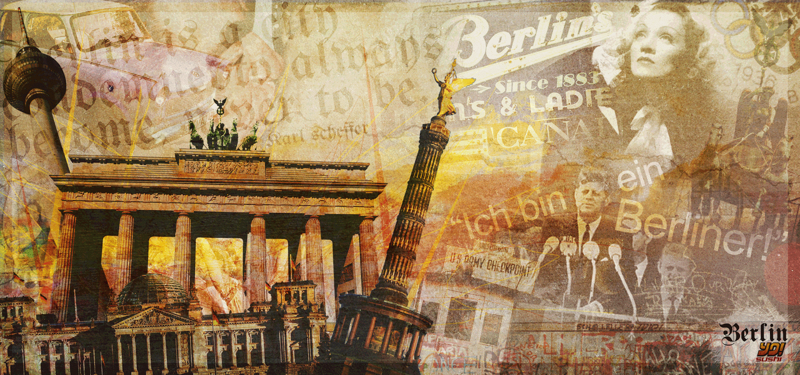
Here are the designs for my menu, including the front, back and two inside sample spreads. I chose to run with the idea of a horizontally folded menu for a few reasons, practically it wouldn't be knocked over as easily or get in the way and the large page size would make it easier to design the inside. And aesthetically, it enabled me to use my mural design (edited slightly) and keep the corporate feel running throughout the restaurant. I was unsure whether to use this design again for the cover, but decided that this mural essentially was my Berlin brand in a nut shell so I would be stupid to only use it once on a mural.

The way that I put my logo together also enables me to make it unique to each item by incorporating words into it such as menu, mail, wine etc, yet still making it recognisable. I chose to keep the front simple with the type as I wanted the images to be the focus, but to tie in the the logo and bring it to the forefront I used a semi-transparent white belt to direct the eye and also to give the design stability and order.


I kept the back design for the menu very simple and dark to contrast with the front, because here I want the focus to be the text not the image as the contact details are more important. I kept the design in with the theme though and in my mind I had it as the backside of the Berlin wall where there's no graffiti or pictures etc, a blank canvas.

When it came to the inside of the menu my main objective was to make it clean and easy to read. I still wanted there to be elements of my mural design, so I used segments of the design as the background which alternated on each page, but again I used a large semi-transparent white box to bring the focus to the menu contents and keep it concise and in order.


The typeface that I chose to use as my secondary typeface was 'Raleway'. The brief stated that the existing typeface that yo!sushi used was Helvetica Neue, but to "...choose a typestyle of that you feel is appropriate". Having used an obscure Germanic typeface for my logo, I wanted to contrast with a really crisp and legible sans-serif typestyle and I think this one works brilliantly.

When I researched yo!sushi's current menu one thing that stood out to me was that there was a lot happening on the pages and it was quite cluttered in places, so I made sure that each page in mine had space so that each dish could be viewed as easily as the next.

Something that I carried on from the current brand was these little mascots, as they appear on the website and designs, and they are traditional japanese symbols which is the roots of yo!sushi, so I thought it would a nice idea to have something visually tying in all the branches different around the world. 

The horizontally centrefold is quite an uncommon style for menu's, but it also means that you have to think differently when it comes to certain hierarchy and how the eye will travel across the page. For example the majority of people are right handed so will flip the page over from the right and that is where their focus will start, so for example that is why my logo is continuously in the bottom right corner. I also felt it was important to have a strong grip system throughout the menu so that the eye can move easily from one image to the next or one drinks category to the next without having to search too hard for what they want to find.

One the whole I am really happy with how my menu looks and serves it's purpose well. I may tweak minor details before I finalise it, but for now I will move my focus onto the wine & beer label designs.

Tuesday 30 November 2010

Menu research...

Now that I have completed my mural I can focus on my other remaining designs, starting with the food and drinks menu. Because of the nature of the restaurant, with so many different dishes and the conveyer belt system, I want to have a clean and simple design that helps people see and choose what they want as quickly and easily as possible. I will look at different menu styles, but here are a few examples of yo!sushi's current menu design...


As you can see, the corporate colours, logo and styling are carried through to their menu design and this is something which I think is very important to create the visual identity inside the restaurant as well as outside. You can also see that it is square in shape and reads like a booklet, the most common way for menu's, and on the whole has a nice clean look to it, although I believe some pages can look cluttered due to the number and variety of dishes on offer.

As much as I like this current design, I am rebranding the restaurant for a new Berlin branch so I can change practically anything bar the dishes themselves. So I wanted to look at some menu alternatives that are already in the market.


Not being somebody who eats out a lot or in new places when I do, I had no idea that people were using menu's in such a variety different ways. Here is just a handle of some of my favourites I came across. There is an origami style, an elegant 2 or 3 fold design, a rough sort of clipboard chart design and even a new digital menu which really shows the technological times that we're currently living in. But I think my favourite out of these is the wooden style menu, but purely for aesthetic reasons.

Although the idea of a digital menu sounds ideal on most occasions, for my yo!sushi branch it would not only clash with the Berlin restaurant style, but it would be a waste as the yo! menu is only to view what is on offer, not to select and pay for like in normal restaurants. And the origami and clipboard menu's would most likely fail in the durability department, despite undoubtedly looking the best, as they would endure a lot of handling and constant use. Whereas although the sleek and elegant folded menu design would serve all the right purposes, is it lacking in creativity? Would it be knocked over all the time with the methods of the yo! dining experience? Purpose and practicality is often overlooked in design, so I need to really make sure I remember to take these into consideration.

Feeling that I have gained a great deal of influence from this research, and have a number of ideas floating around my head, I will now get designing and report back soon.

Tuesday 23 November 2010

Done and dusted!

After many changes and alterations I feel that my mural design is now complete. Here is the final product, click to enlarge...


Although I will talk more about this in my development file, I will briefly explain some aspects of my design. I felt quite strongly about including some typography in my design, and used two very different typeface styles that I found in my research. One used for the infamous JFK quote "Ich bin ein Berliner!" and the other for a quote I came across that to me, really sums up Berlin's culture and the direction in which it is heading,"Berlin is a city condemned to become, not to be."

The logo has changed since early on in this project, but that is a result of my menu design that I have been working on along side this, but will discuss that when I come to showing those designs later on in my blog.

I have also added many more elements to the design and although it may look clustered at a small viewing size, blown up over a whole wall of a restaurant I think it will work brilliantly, noticing something new every time you look at it which is exactly what I was aiming for.

And finally the colour that I added to the design. Apart from faintly adding a yellow, red and black gradient over the whole designs, which helps tie in all the images, I focussed on applying the colour to the main focus images of my mural. Below shows briefly how I did this.


I wanted the colourful illustrations to be 'bursting' from these main landmarks and features of todays Berlin and pour over the rest of my design, contrasting with some of the historic black and white figures in the design. I feel this works well, and the grungy, messy style it has to it links in with the whole Berlin wall idea and feel that I was going for.

Once I have asked for final feedback and comments off my tutors, classmates and friends This design will be complete, and I can now move on to my menu design.

Wednesday 17 November 2010

Mural nearly there!

Although I have been working on other designs, such as menu and direct mail, along side my mural, this has been my main focus (in this particular brief) and I believe that it is nearly complete. Touch wood.


The main differences are the arrangement and positioning of the main images, as well as the background images. I really wanted the landmarks to stand out from the rest and I have thrown them right under the viewers nose. I started the think about how the eye looks at an image (mural in this case) and how it travels. I believe that the way I have put these images together, now creates a sort of 'viewing journey' shown below...


I still have a few more ideas of how to pad out my mural design a bit more and bring some colour to it, but once I have done that I think my mural will be complete and I can focus on the other designs for this brief.

Monday 15 November 2010

Mural update.

Progress is being made on the mural front, slow yet steady! After deciding that my main images weren't working with the rest of the design, I opted for a change in canvas shape. It may just look like I have extended the width of it, but there were a number of reasons behind this choice. The main one being practical as it would open up more space for the primary images, but also, the fact that from the start I have wanted to focus on the style of the the Berlin wall and I think these new dimensions resemble that a lot more accurately. Here is where I'm at...


I think the shape as a whole is much more positive than before, but I still hove some issues to address. Having taken away the white outlines of the images I have managed to integrate them into the design more, but I need to decide on what role I want them to play in the design and how much I want them to stand out. Something else is the empty spaces created with this new shape, I don't want to stretch images just to fill spaces because like my influence Devante Chang, I want there to be something new every time you look at it, so if anything I want it to be on the 'busier' side of things. I'm still developing though so can work on that, as well as where to put the primary images, I think maybe the centre of the design isn't the right place for them.

Saturday 13 November 2010

Mural continued...

I have started to apply some of the main images to my mural. I looked back to Javier Piraguata's style when I started doing this, and experimented with angles and positioning of the images. Here is what I have so far...


I rearranged the background slightly so that certain images wouldn't get covered and lost, however there is something about this that doesn't sit easily on the eye. I applied a white border to each image to create a 'cut-out' effect, but I'm not sure if this is stopping them blend with the background totally. It is definitely a case of trial and error, moving the images about and changing sizes until something clicks and they start to work well. Maybe even a change of canvas size would help with this, but I will continue to develop and report back soon. 

Mural images...

Having decided that I wanted some of Berlin's most prominent landmarks and popular figures to be the most noticeable in my mural, I started looking at ways I could achieve this. I think because my background is quite dull and washy, in a good way, these will need to be more bold and positioned cleverly.

Firstly I will just show how I edit each image that I want to stand out more...


Step 1: Select a clear image and crop out the main object.

Step 2: Used a layering technique, where I duplicated the image a number of times and edited the filters to such things and overlay, multiply and colour burn. Once I then found the best opacity levels for each layer, I came out with an image that was stronger in shadows and highlights, and also had a richer colour.

Step3: I created a gradient from the German flags colours, and applied this to the image using overlay.


The same steps were repeated for each image so that there was some continuity, however depending on the original image, the deep warming colours of the gradient would alter each image slightly giving each one individuality as well. Overall, I believe that this technique will help the images work well with my background, but not blend in too much and become lost.

I will work on how to incorporate these images into my mural design.

Thursday 11 November 2010

Start of mural

Having worked on my mural for the past few days, I thought I should show where I have got to up to now. Here is the basis of the background that I have put together. This is mainly made up of historic images and icons that aren't the main focus because although many people know about the majority of them, the target audience for yo!sushi is still relatively young.


Despite this still being an early stage I am happy with how the design looks. I will work on blending the images together better for the background, and also on textures and and colour tones. I will carry on with my development.

Friday 5 November 2010

My Yo!Sushi Logo.

The first thing that I set about designing, or re-designing, was the yo!sushi logo. After a lot of thought I decided that I wasn't going to keep the pink and orange corporate colours. This was simply because I felt they would clash too much with the design style I was going for.

Here is how I edited the colours in the logo...


With the the colours of the german flag being yellow,red and black I tried to apply that to the logo. To me this immediately gives it some corporate identity towards the country. When it came to incorporating the 'Berlin' part into the logo however, it wasn't such an easy decision.

I looked at the typefaces that are used in Germany, and managed to take some photo's while I as there of some in context. They use a very strong and clean san-serif font for all their road signs called Condensed Din, and they try to use this same style on a lot of their more modern signage.

Condensed Din


Here are two attempts at using bold, strong and clean san-serif typefaces with the logo...the second having a slight eastern european feel to it.


Another typeface that really stood out to me was the 'old-school' black letter style type. This has a very stereotypical, old fashioned German look to it, but I was surprised how much it was still used today. It is no longer used in newspapers, but can still be seen on a lot of signage and on many buildings, here are some examples...


I really love this traditional look, and think it would be brilliantly contrasting with the ultra-modern yo!sushi logo. This links together the old with the new, and could be something of a them that I carry on through my mural and restaurant designs, here is what I put together.


Although I am not sure about the way the positioning of the different elements look, this is definitely the style that I am going to run with and I can review that problem at a later date when I start to apply it to my designs.